

July 15th, 2026, posted in news
by Adelina
A Brazilian client came to us several months ago asking for a UI/UX assessment for their document management app. We were intrigued, as the app sounded interesting, and doing assessments is a great way to brainstorm and innovate.
What started with a quick meeting - held half in English and half in Portuguese - led to an entire redesign project that not only improved their app’s UI, but also added useful new features and fixed UX issues customers were complaining about.
In this article, we’re going to tell you about how we took this project from a simple request for a free UI/UX assessment to an entirely new look & feel.
How a UI/UX assessment started it all
Trust Image first contacted us through our free UI/UX assessment form. They weren’t entirely happy with their app, WebGed. Some customers were complaining that it’s hard to use, they can’t find what they need, and that it lacks important features.
So we sat down with their team and chatted for an hour, in the summer of 2024. We asked them to take us through their existing app, to show us how it works, all key features, and what exactly doesn’t work for their customers.
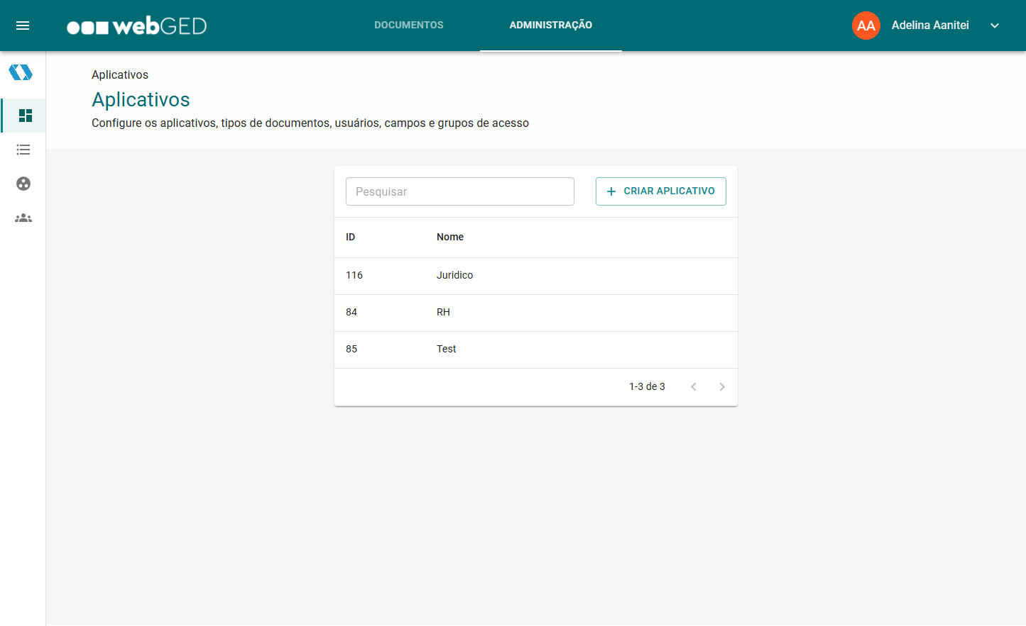
We found out that WebGed is a document management system whose main feature is a complex search. This allows people to find words within documents, dates, people and so on. Companies can make their own accounts and manage entire departments and employees belonging to each of them.
Right off the bat, we noticed UI/UX issues. Granted - after so many years of building software, you develop an eye for the little things. The app’s navigation was a bit confusing, having options both on the upper nav bar and on the sidebar. The main search functionality had an advanced panel that opened to the right and not below the search bar. Editing documents was confusing and had a few errors, and the flow to create document elements was nested in several different pages.
We told them right away about some of these issues, but we took our time going through the app so we could do a proper assessment.
How our free UI/UX assessment works
When we do a UI/UX assessment for an app, we review the following criteria:
-
Onboarding: the signup process, the presence or absence of guided tour (when needed), access to documentation and support, and presence of/ease of access to helpful onboarding materials.
-
Navigation: are the sidebar and header well structured, can you easily switch between user roles if needed, is app hierarchy handled well - where applicable (e.g. many companies with multiple workspaces, each workspace has multiple user accounts, with each user account having their own menus)
-
UI elements & consistency: are the UI elements consistent in terms of look and behaviour?
-
Aesthetics: is the UI clean and modern? Does the design system match the brand look & feel, colors, etc?
-
Appropriate feedback for a user action: if the users receive adequate feedback from the app when they perform an action, and they know where they are and what is going on at all times (including the progress they are making if it's a complex task and a sense of closure when they are done)
-
Error handling & prevention: allow easy reversal of actions, error messages that make sense (clearly indicate problem, suggest solution), giving users a confirmation modal in the case of error-prone actions
When reviewing these, we look at what’s looking bad in terms of each criteria and we jot down suggested fixes for each issue. At the end, we give a rating from 0 to 10 for each criteria, the total of which will form the app’s usability score.
Our review doesn’t end here though: after reviewing the main usability criteria, we also take a look at a few key pages from the app. We signal what issues we saw and what solutions we suggest for each, alongside general recommendations for said pages. This is a great way to give feedback on important app features and fix the biggest usability issues.
Our UI/UX assessment of WebGed
We thought WebGed was a great app overall, with a very useful concept. It was clearly catered to specific people such as law firms, who work with a lot of paperwork and sometimes need to find “that one file”. And most of all, it was in Portuguese, so it was made to be used domestically.
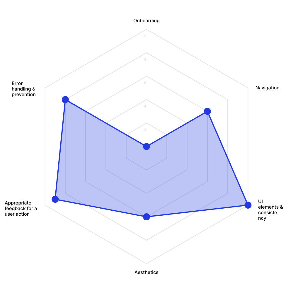
Here’s how we assessed each criteria:
Onboarding: 0
Users can get support through the sales team, but they can’t just create an account themselves. This should be done as much as possible through the app.
Navigation: 6
Pain point 1
The navigation looks a bit confusing at first glance. You can't figure out what's in the sidebar.
Solution
Moving the admin section to the user dropdown in the upper right corner. Keep the sidebar open by default. Adding submenus to key menu items, especially in the admin part.
Pain point 2
There's space on the sidebar for more items.
Solution
Adding quick actions to the sidebar menu, like uploading new documents or creating new document fields.
Pain point 3
You can be part of a specific department in a specific company but that's not very clear.
Solution
Add some titles in the sidebar header to make it clear you're viewing departments and companies. Right now it looks like bits of text only.
UI elements & consistency: 10
The app uses Google Material design, thus all elements are cohesive.
Aesthetics: 6
Pain point 1
The UI is clean, however it's vanilla Google Material. It appears like a Google app, and doesn't have any original or individualized features.
Solution
Customising the UI to make it look like an original app, with no ties to Google.
Pain point 2
The design system could be slightly customized to look catered for the webGED branding. The colors in the UI don't match the branding. It just looks like a Google app.
Solution
Matching the color system to the brand colors (the turquoise and the navy blue in the logo for instance).
Appropriate feedback for a user action: 9
Pain point
If you haven't selected anything in the advanced search, it will still make the search.
Solution
You could give out a push notification saying "You haven't made any selections" or disable the button.
Error handling & prevention: 8
Pain point
I got an error that covered the entire screen, which looked like pieces of code instead of a proper error message. It was also a bug in that given situation.
Solution
Ideally, the error shouldn't appear like this but this is a bug.
.png)
We also reviewed three key pages from the app. The main search page had a lot of unused space and placed the advanced search to the side, even though it’s usually below a search bar. The document editing portion also had a lot of empty space, it had a few bugs, and squeezed a lot of elements together through small padding. We also reviewed their overly nested document fields creation process, which you had to go through three tables to reach despite being an important feature.
The redesign
After receiving the UI/UX assessment and holding a meeting together to discuss it, Trust Image decided to hire us for an app redesign. Alongside what we’d discussed, they also wanted to add a folder feature and improve the app’s look and feel overall.
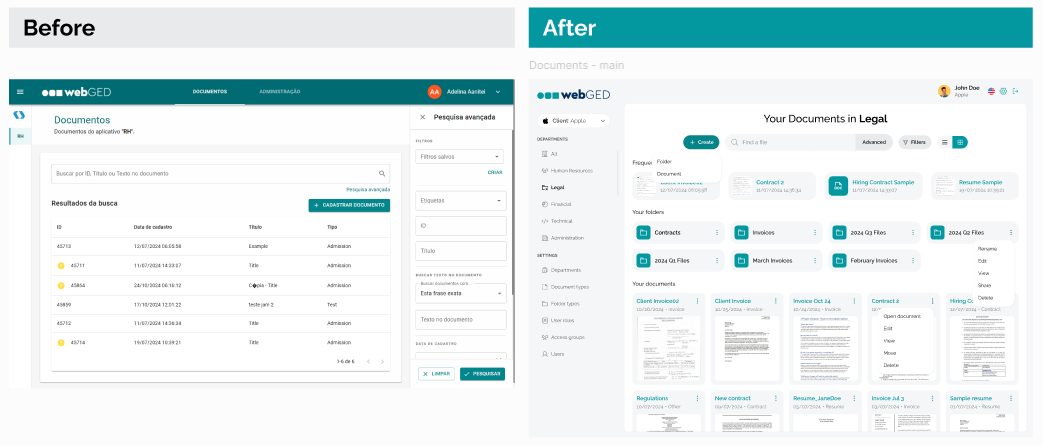
We decided to completely transform the app’s UI while maintaining their branding, in order to make it look more like their own app and not a Google app. We used a lot of gray tones and their brand color (turquoise) as the accent color. We also used a lot of round shapes, giving elements such as buttons and fields very rounded corners.
We overhauled the main page the app starts with: a button to create new folders or documents, a search bar, filters and view options come at the top, as they're the most used options on the page. The user’s most recent documents are featured at the top, followed by their folders and documents in chronological order.
We also improved their navigation and moved it all to the sidebar, as opposed to being split into the upper bar and the sidebar, as before. Users can now access their departments and settings in the same place.
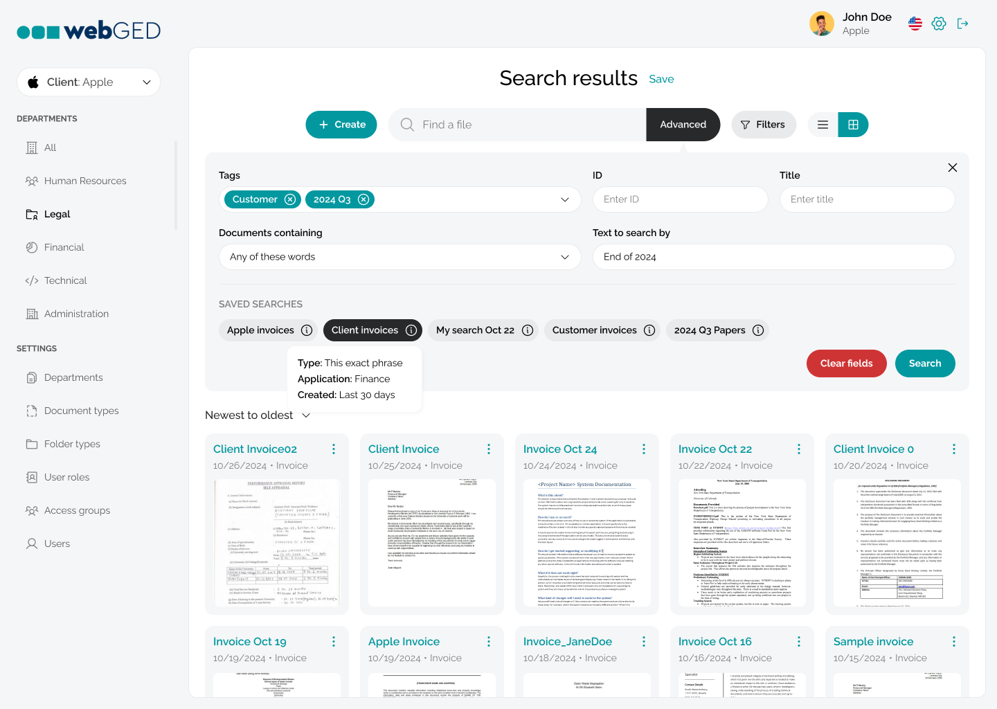
We moved the advanced search where it makes more sense, below the search bar. However, since we moved some options into the filters, this might not be accessed so much. So pushing content by opening it is not such a big issue.
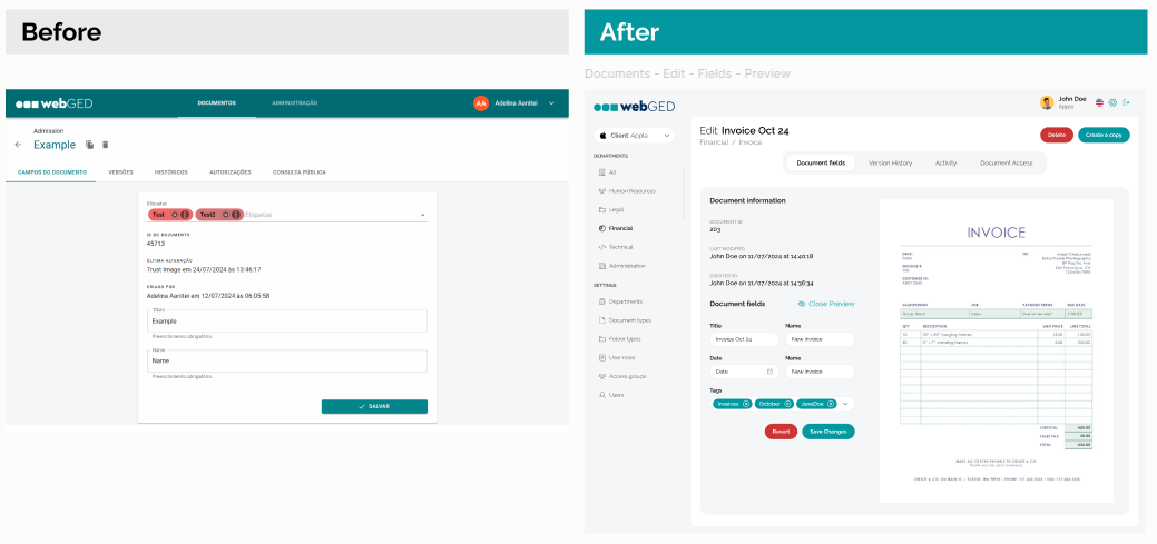
When it comes to document editing, we decided to make better use of space and also add a feature the client wanted, which is previews of the document in question. Edit fields are better sorted in the new version and they’re better spaced out so they don’t feel so suffocating.
We also improved their field adding feature, which was their biggest issue before the UI/UX assessment. As it still had to be nested, since their system requires you to add fields to specific document types, we decided to add that option in the document type edit page. This made more sense to us and the client as well.
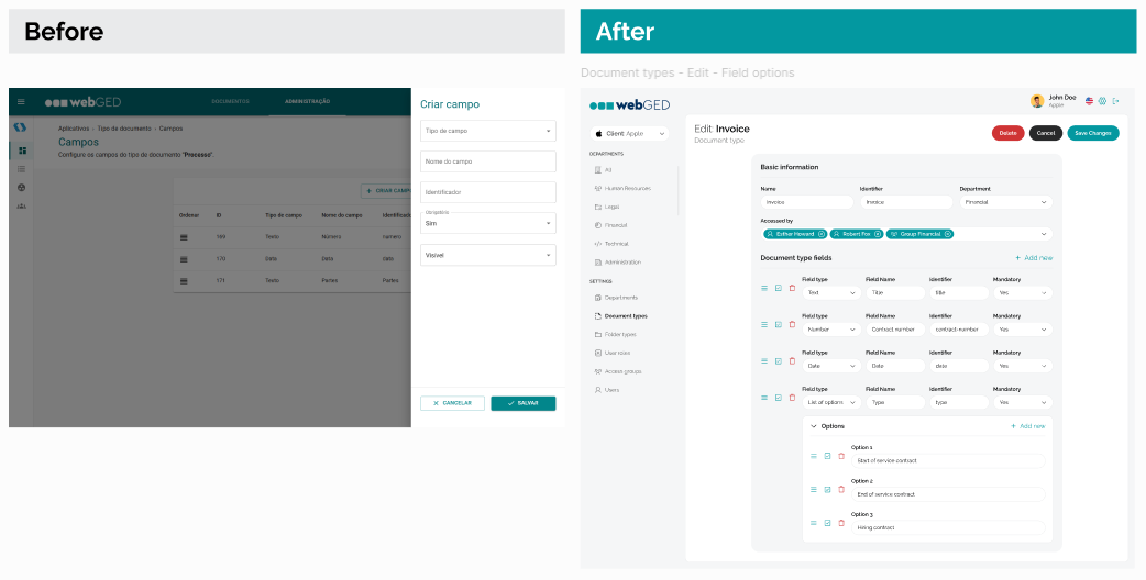
Overall, we made the app look prettier, easier to use and addressed the pain points we highlighted during our free UI/UX assessment. The client was happy with the results and has been working on bringing the new app version to life.
We hope you enjoyed this case study and found Trust Image’s story interesting. This shows how easily you can improve an app if you sit down and review it with key criteria in mind. And that’s what our free UI/UX assessment is for: pointing out what’s not working for your app and helping you fix it.
Looking to improve your own app? Drop us a line and let’s do a UI/UX assessment worth $3K for free. Your app might be our next successful redesign case study.


