We put the user (back) in user interface
Want to design an awesome UI, the kind your users deserve? Whether you`re looking to build one from scratch or to redesign your existing app, we have what it takes. Our UI/UX process covers in three steps everything you need to design for usability and code for success.
Fast-forward to the final design.


One short meeting that gets a lot done.
We meet with you to understand your business, vision and core app requirements. Kickoff meetings are all about setting the right tone for eveything that follows: from the app`s overall look & feel to user flows and use cases. We`ve put in place a solid workflow, so you spend as little time as possible meeting with us, while still keeping everyone on the same page. Regardless if you are designing a new app or redesigning an old interface.

Get final screens, not wireframes.
After the kickoff meeting, we start working on the UI design. We deliver more than mock-ups: we deliver the actual design of your app screens right from the start. This allows us to iterate fast and it gives you an accurate representation of how the app will actually look and behave.
Rather than sitting in countless meetings, reviewing wireframes which tell you little about the end product`s look, we do it differently. This approach allows you to make important decisions early on, by addressing aesthetics and functionality at the same time.
Introducing UFOs. The undeniable proof that
good UI/UX is out here.
Based on thousands of hours of design meetings and feedback, we`ve organized what we`ve learned into a 3+1 design framework called UFOs. UFOs is a set of best practices we apply in our day to day UI/UX work. It`s also an acronym for the key four steps in designing an app:
- Understanding
- Foundation
- Original design & functionality
- Stress testing
We take care of every little component
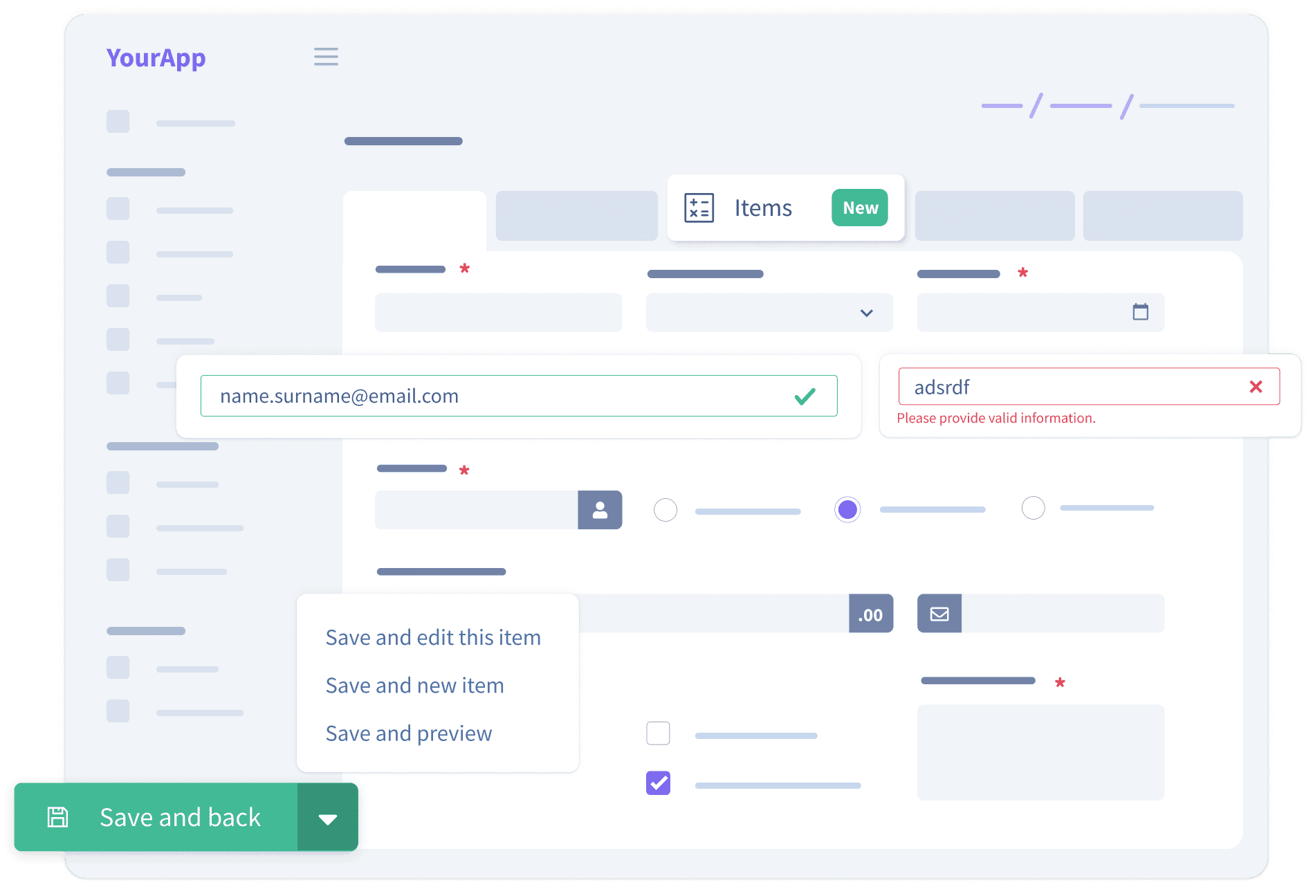
Ten versions of the same CTA button? Five different icon styles? Not on our watch. We keep everything consistent through custom-made design systems and we create easy-to-code components. This way, you can build new screens fast using the pre-built elements, and keep everything looking sharp.
We design for complex SaaS applications
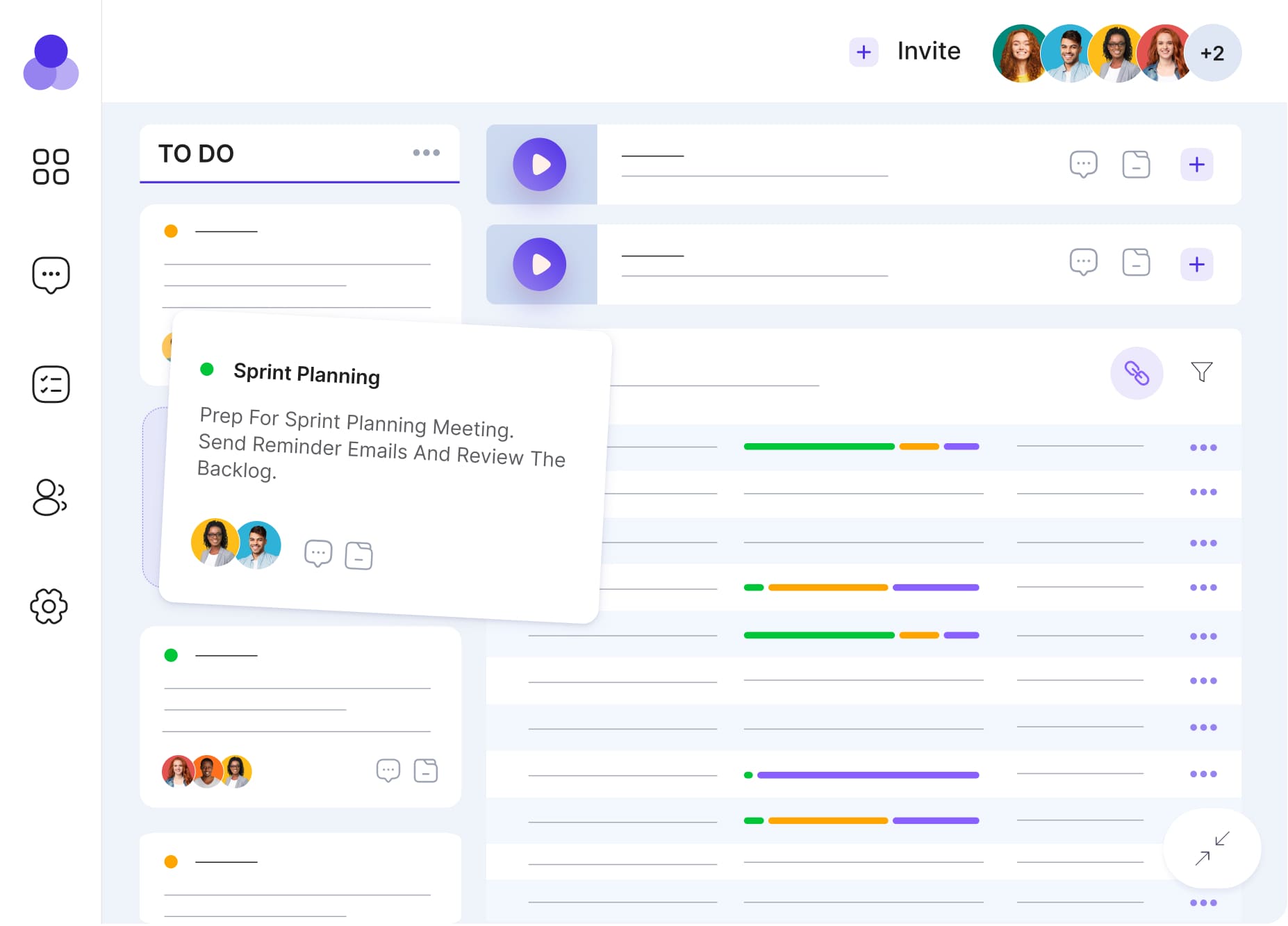
Complex doesn`t have to mean ugly or hard to use. Charts with hundreds of data points, tables with dozens of filtering and grouping options are just a few of the things we specialize in as heavy-duty UI/UX designers.

We design keeping industry in mind
We work hard to understand your business and industry and to have this reflected into the app we`re designing. Our ultimate goal is to take the industry standard way of doing things and significantly improve it.
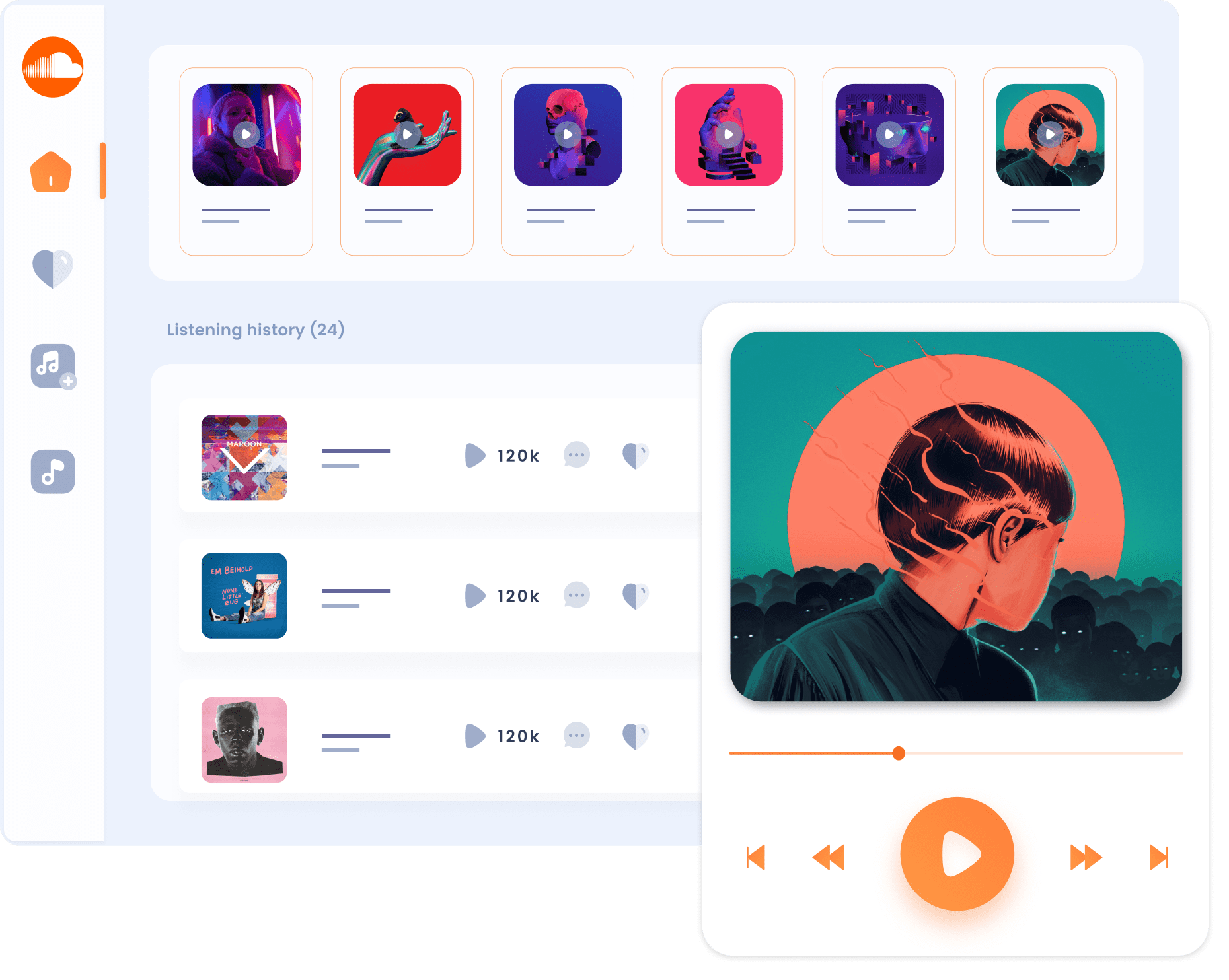
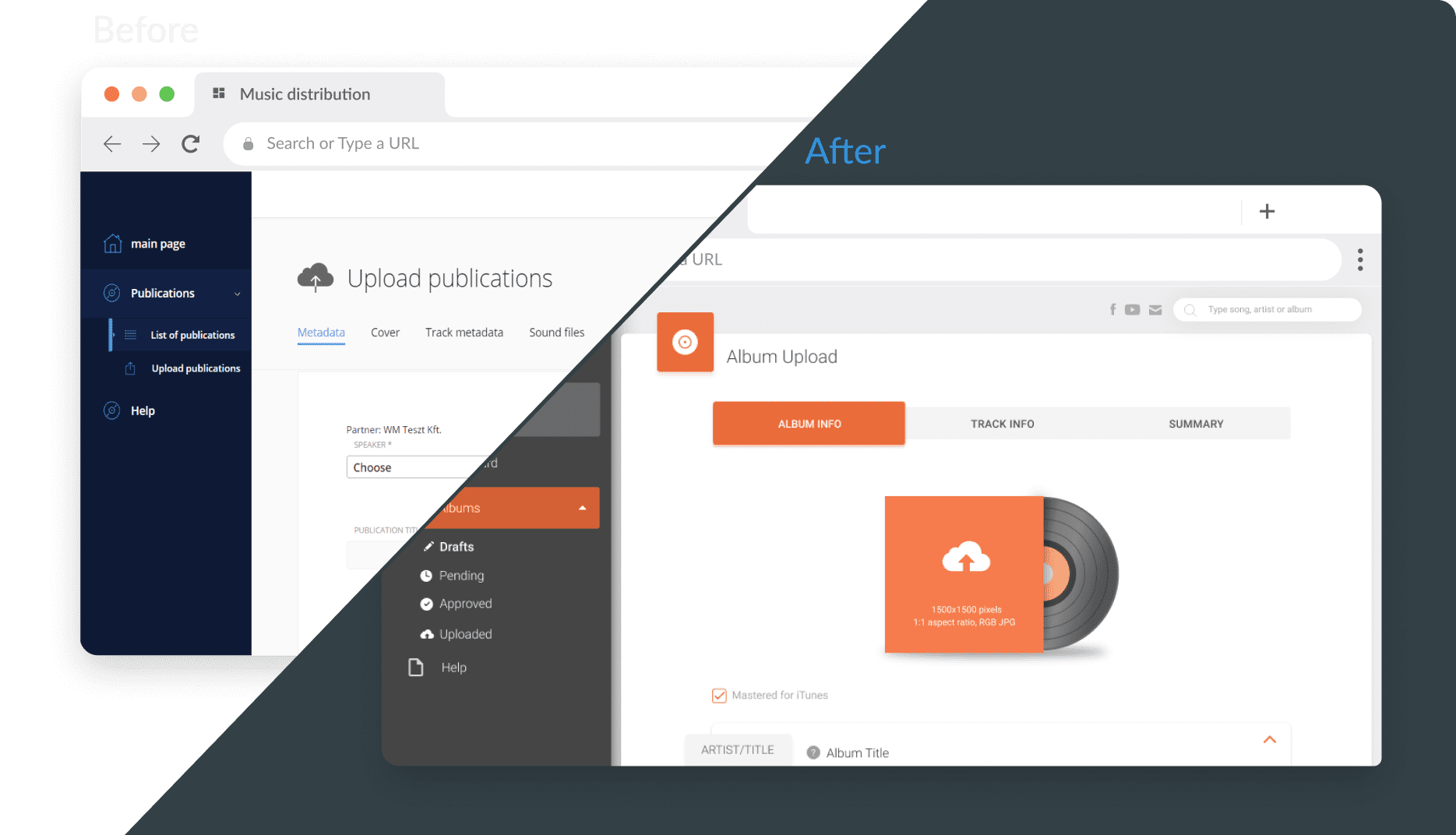
Your old app can look like new. Fast
Time to move on from that MVP look & feel? Or just interested in some small
touch-ups? Here is how a UI/UX redesign can help your app thrive.
Improve the look & feel
A picture is worth a thousand words. And so is your UI. It speaks volumes about your brand and your product. Improving your app`s look & feel is a proven way to increase user engagement and revenue.
Clean up your user flows and UX
Redesign work is more than just about looks. In the process, we clean up redundant user flows, weed out legacy features and overall imagine a better way of doing things to improve user experience.
Establish a design system
We go through your entire app and redesign elements into reusable components, which are easy to code and consistent. When we`re done, you`ll have a design system to match your brand.
Read our latest articles on UI/UX design
We have all the right tools
From Figma plugins to UI Kits and dashboard templates, we have the tools to deliver powerful designs, while making development a bit easier.
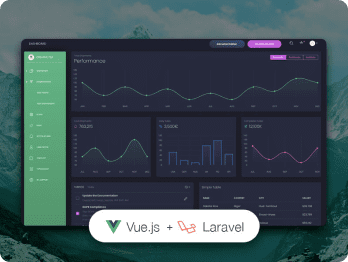
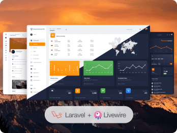

Our handcrafted UI/UX products
We partnered with Creative Tim to deliver the best, fully-coded UI tools. Handcrafted by professional designers, these templates and components make any design stand out. And the best part? They are entirely developer-friendly.
Want to know more about us?

For eye candy and our UI/UX portfolio, follow us on Dribbble.


