

July 15th, 2026, posted in news
by Adelina
Imagine a world without principles. Especially in the context of design and governance, it would likely be chaotic, unpredictable, and challenging to navigate. This scenario is also available for designing apps or products without principles.
If you ask a bunch of UI/UX designers on what principles they rely on while designing a product you will most likely receive different answers. Some might be faithful to user centered design while others might swear on colors and contrast.
There are some lists of principles out there that you might have heard of, created by experts in the field. One example is “KISS” - Keep It Simple Stupid, that implies creating a simple design, when you are doing it for non-experts. Another iconic example is Jakob Nielsen’s ten “commandments”, addressing basic human behaviors.
It might get a little bit confusing when deciding which of all these principles you should follow, in order for your product to come out in the best shape there is. So, at the end of the day, you want to know exactly how to tackle this design principles issue.
In this article, we'll explore the fundamental UI design principles that every app designer should embrace to craft apps that users love. But, first of all, let’s talk a little bit about UI/UX design principles and their importance.
What are UI/UX design principles
Before delving into lists and examples we should make sure that we’re on the same page. Design principles are concepts and guidelines that you can use for creating user interface designs. These exist so designers can create designs that are not only pleasing, but also intuitive, user friendly and functional.
Why are UI/UX design principles important
Even though you know how to create a button or an input field, you have to know where it is ok to place it so it serves its purpose. UI/UX design principles are essential for several reasons, such as helping the user focus his attention, making the design consistent, or solving complex design problems.
But let’s finally cut to the chase! Here is a list of design principles you might want to consider before starting your next projects:
Prioritize Simplicity and Clarity
Nowadays it seems like nothing can be new and surprising anymore. Maybe that’s why a simple design is superior to a more intricate one. However, it can be quite hard for some folks to understand that a more complex design is not necessarily a better one.
Simplicity isn't just a design choice; it's a philosophy that champions ease of use.
Even though the phrase "less is more" may sound like a cliche, it can be quite a good aspect to focus on during the design process.
Try to avoid unnecessary elements, too many colors or text that is so long that no one reads it. Keep it nice and tidy, so the user won’t become confused while scrolling through the app.
Keep it Consistent
Consistency in design elements fosters familiarity and usability. Elements such as colors, fonts or layout can make the interface feel intuitive. Users can feel more at ease and in control recognizing items that are familiar to them. Maintaining a uniform design language ensures that users always know what to expect.
A consistent design can also reduce confusion, as the user recognizes navigation or icons. If this type of element looks familiar the users can predict how they work in different parts of the app.
Designers often achieve consistency through the use of design systems. These systems include guidelines, templates, and reusable components that ensure all design elements remain uniform and aligned with the brand's identity.
Focus on User-Centered Design
At the core of great UI/UX lies a deep understanding of the end-users. Techniques like user personas and journey mapping help designers create experiences tailored to user needs. When you design with users in mind, you prioritize usability, which leads to higher user satisfaction.
Also, when users feel that a product understands and caters to their needs, they are more likely to engage with it. This could lead to increased user retention and, in the case of digital products, higher conversion rates.
Master Navigation and Information Hierarchy
Think about an app’s navigation as a well-constructed road system in a city. If it’s done right it allows people to move from one place to another without getting lost or frustrated.
Clear information hierarchy helps users prioritize and find content efficiently. Think about it as a road sign, that is helping them prioritize and locate content with ease. This hierarchy ensures that users can swiftly access the most relevant information, enhancing their overall experience with the app.
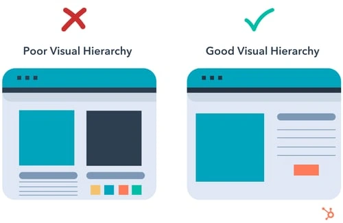
Harness Visual Hierarchy and Typography
Visual hierarchy directs attention and puts emphasis on content. This helps users understand the importance and sequence of information. In a web or app interface, elements with higher importance should stand out more prominently.
Taking into consideration visual hierarchy can also help you organize content logically. For example, headlines are typically larger and bolder than body text, making it clear what the main message is. Users should be able to scan the content and quickly grasp its structure.
We must not forget that CTAs, such as buttons or links, are supposed to be visually distinct. Users should immediately recognize where to click to perform a specific action, like making a purchase or submitting a form.
Color plays a significant role in visual hierarchy. Bold colors and high-contrast combinations draw more attention than muted ones. Designers use color strategically to highlight important elements. For example, a button should always be in a primary color, or surrounded by less saturated colors, to make it stand out.
We can also think about red, being associated most of the time with an error, or warning, and green suggesting the success state: “stop” and “go” colors.
Embrace Testing and Iteration
Testing involves real users interacting with the interface. Their feedback and behavior provide invaluable insights into what works and what doesn't. This user-centered approach ensures that the final design meets the actual needs and expectations of the target audience.
Iteration is the process of making incremental refinements based on feedback and testing results. It allows designers to address issues and optimize the user experience over time. This continuous improvement cycle ensures that the design remains relevant and competitive in a dynamic digital landscape.
Through testing and iteration you can identify usability issues, bugs, and design flaws, which allows you to rectify them early in the design process. These practices can also lead to a more polished and user-friendly interface. Satisfied users are more likely to engage with the product, recommend it to others, and become loyal customers.
Don’t skip on trends
Even though trends come and go, it’s always a good idea to keep an eye open to all innovations out there, to keep your designs fresh and relevant. It can also help with finding inspiration when you are stuck or with thinking outside the box.
However, make sure that you maintain a balance between using trendy elements and ensuring they work hand in hand with the specifics of the target audience. Not every trend is suitable for every project, so careful consideration is key.
For example, the “scrollytelling” is really popular nowadays, which uses scroll interaction for the design of landing pages. If you want to hit the nail on the head you can rely on minimalism, which never seems to be outdated.
On the other side there are trends that we wish to never come back to, such as the infinite scroll, on webpages, or the pop-ups asking you to subscribe to a newsletter, after 5 seconds spent on a site.
Mastering UI/UX design principles is a journey that transforms good apps into great ones. It’s not just about creating visually appealing designs, but also about crafting experiences that meet users’ needs and leave lasting impressions.
Remember that this field is ever-evolving so you have to stay curious, adaptable and user-center-focused, in order to create remarkable digital experiences.
Need a hand? Feel free to contact us, so we can discuss more about your product, your hopes and dreams. We are positive we can make it work together.


