

July 1st, 2026, posted in for_founders
by Miruna
Most product teams focus all their time and energy on building their software product and launching the MVP. But in all that rush, some things that are out of sight can also become out of mind. Here are 10 common UX issues that are sometimes overlooked or discovered only in retrospect.
1. Unclear instructions and feedback
At the end of the day, all software products are a means to an end. They`re a way for users to DO something, whether that`s checking their financial balance, tracking their weight loss or taking a course.
Bad UX often fails at providing users with clear instructions on how to reach their goals and appropriate feedback when they do take action. In the words of Jakob Nielsen, the father of usability heuristics, there`s a lack of “system status visibility”. What does this mean? The app should always keep the user informed about what's going. Is the input currently selected or active? Is the button I clicked correctly interpreted by the app as a click? Did I fill in the correct information?
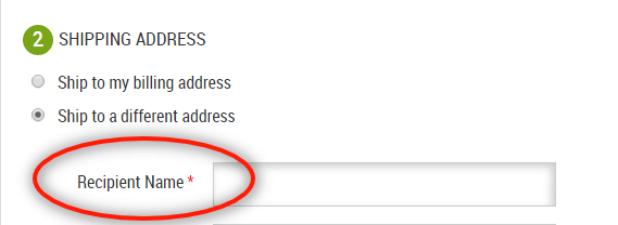
Example: Input forms
Users rely on instructions and feedback to correctly fill out input forms. Clear field labels are key to let the user know what they should fill in. Many ecommerce platforms allow different shipping and billing addresses. Marking the field as “Recipient name” instead of just “Name” makes it clear that the order could also be for someone else.
[Source: zuko.io]
Data entry instructions can also include: documents the user needs to upload, restrictions that apply to certain fields or any number of requirements (e.g. the address you type in needs to match the address on your bank record).
Users need feedback to know their submission is correct. Inline validation means that as soon as the users finished filling out a field, they should know if there`s an error. This can be a required field, exceeding character limit, wrong input format etc.

2. Badly written microcopy
Microcopy includes any type of text that informs and assists the user, from tooltips and labels to placeholder text and error messages. When compared to the big things like the actual design or layout, microscopy might seem like…a small detail. In fact, microcopy is the voice of the software product and the main way of guiding users through the application.
Bad microcopy tends to be:
- Ambiguous ➛ users are not sure what the outcome of their actions will be
- Lengthy ➛ unstructured information, passive voice, filler words and jargon
- Inappropriate ➛ shaming users for opting out or making a mistake, bad puns, pushy tone of voice
- Unhelpful ➛ doesn`t provide any context or additional clarification
- Inconsistent ➛ lacks naming conventions or a style guide
Example: LinkedIn setup wizard
When setting up your company page, LinkedIn provides a wizard with several steps. One of the steps includes showcasing your company values and commitments: “Showcase what your organization cares about - top talent are looking for employers who share their values”.
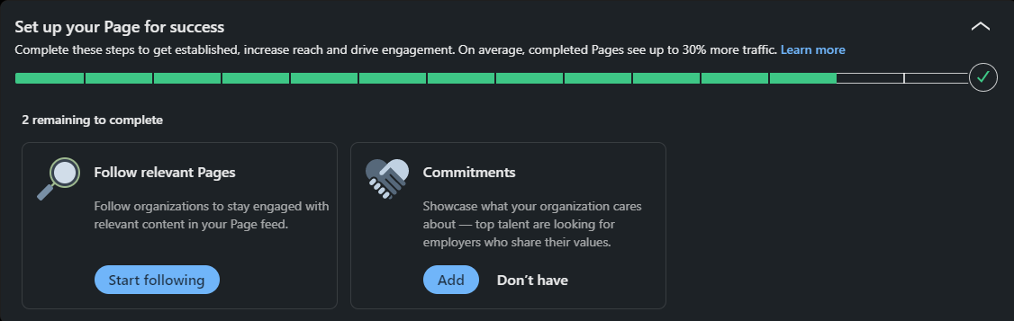
The user can choose between two options: “Add” or “Don`t have”. The way the second option is phrased suggests that users who don`t add their values actually don`t have any. Users are shamed for not completing the action by implying their organization doesn`t care about such commitments.
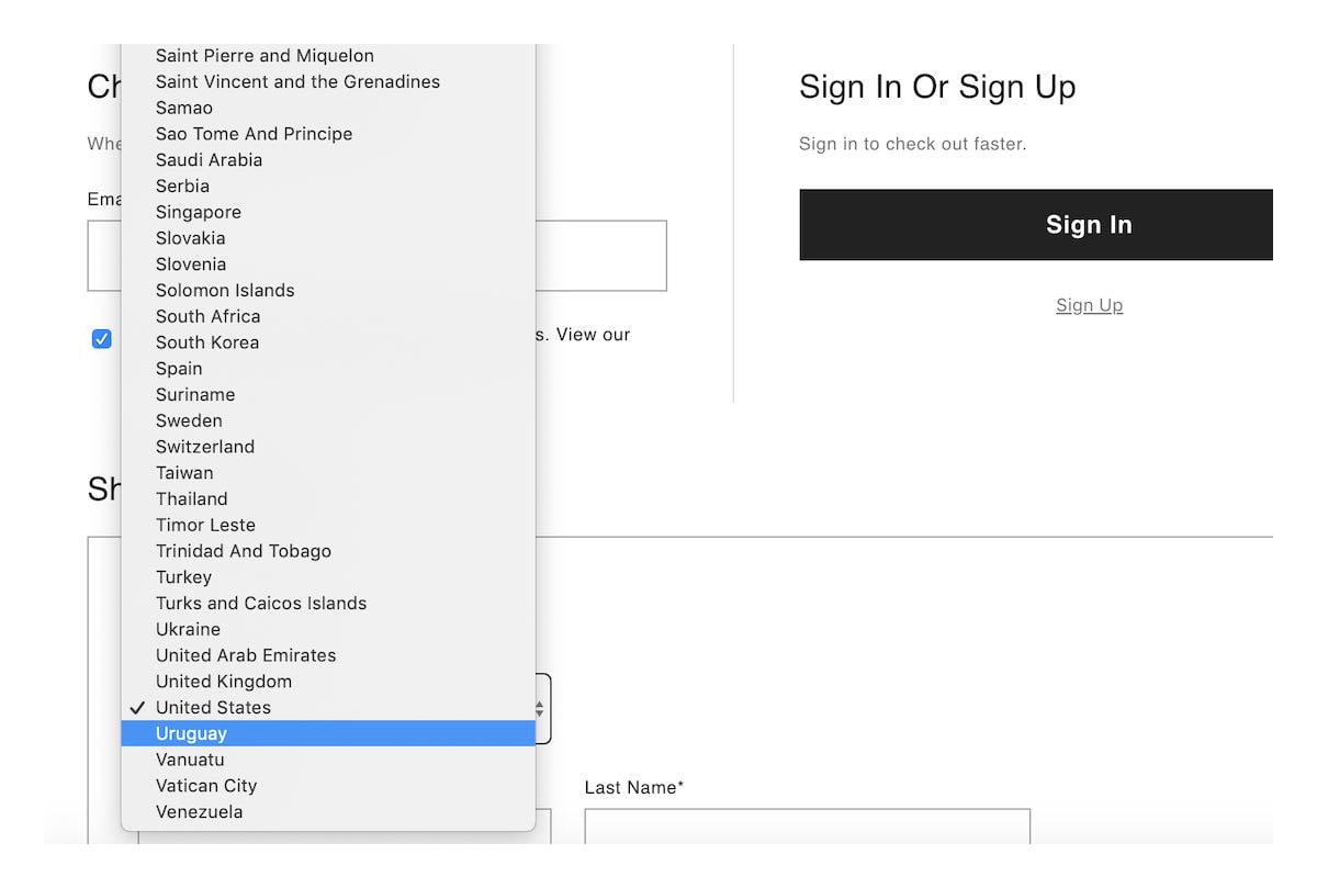
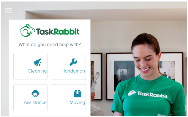
3. Long dropdown menus
Have you ever tried picking out your country from an incredibly long dropdown with no search? Or even worse, imagine trying to select something from a really long dropdown when you`re not even sure what you are looking for.
When it comes to dropdowns, bad UX loses users a lot of time because they can`t filter, search or use autocomplete. An alternative would be to group related items into categories and use a filter. The dropdown will then display only items in that category, thus making it considerably shorter and easier to browse. Of course, most of the time, a field with autocomplete can also do the trick.
[Source: careerfoundry.com]
4. Unlabelled icons
There aren`t a lot of icons whose meaning is universal. Even then, some users run the risk of misinterpreting them. Things get even trickier with nonstandard icons, where users have an even harder time understanding their purpose.
Pairing icons with text labels reduces some of these risks and it allows users to:
- Recognize the meaning of the icons faster
- Distinguish between several actions placed next to each other
- Learn the interface easier through visual and textual cues

5. Stacked modals
Modal windows are often used for actions like adding new items, editing existing items or reading more information about a certain entry. They appear on top of the current page with an overlay to prevent distractions and allow the user to focus on the modal.
However, relying on modals too much can become tricky fast. Especially if you have complex user flows with a lot of actions involved. Complex applications run the risk of stacking modals on top of each other, which can lead to several UX issues like:
- Workflow disruption: too many modals can disrupt the natural flow of the user`s tasks and make it more difficult for them to exit the stacked windows. The user would have to close each window to return to their primary flow.
- Loss of context: because modals block the underlying content, users might lose useful context. Especially if they want to reference that information when filling out fields in the modal.
- Cognitive load: each modal window adds new cognitive load because the user has to shift their attention from one window to the next. Multiple modals can overwhelm users and make it difficult for them to understand the hierarchy of information or remember what they were doing.
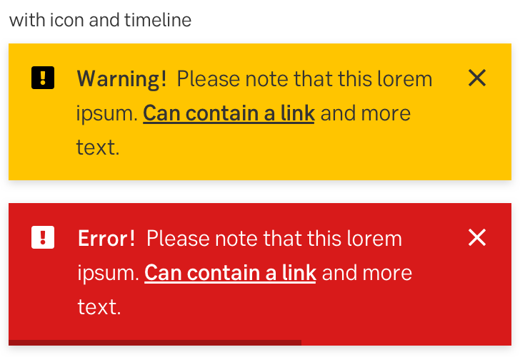
6. Vague errors messages
“Oops, something went wrong. Try again.” is one of the most popular examples. The main UX issue here is that the error message doesn`t explain what`s wrong and how it can be fixed. A good error message should explain the problem in a clear manner and allow users to act on it, even if it just means contacting support. If the error message has a “yes” or “no” button, consider adding an action word after it for clarity: “Yes, reload the page”, “No, stay in the app”.
Poorly written error messages are lost opportunities for users to get to know the app better. Users might not invest a lot of time in reading documentation for example, but they will certainly be motivated to fix a problem (and learn more about the app as a consequence).
[Source: Seb Group Design System]
7. Not knowing what`s clickable
Even if your design is completely flat, without any shadows or gradients, interactive elements should still look…well, interactive. There are a lot of ways to suggest clickability, including borders, color, size or icons. If users have a hard time determining what is clickable and what is not, they are more likely to abandon their journey through the app.
Some of the most common ways to provide cues that something is clickable include:
- Shadows, color contrast or a 3D, “raised” effect
- The cursor changes to a pointer, hand or other relevant icon to indicate interactivity
- Visual feedback when a user clicks an element: changes in color, size or animation to suggest that element is pressed or active.
[Source: nngroup.com]
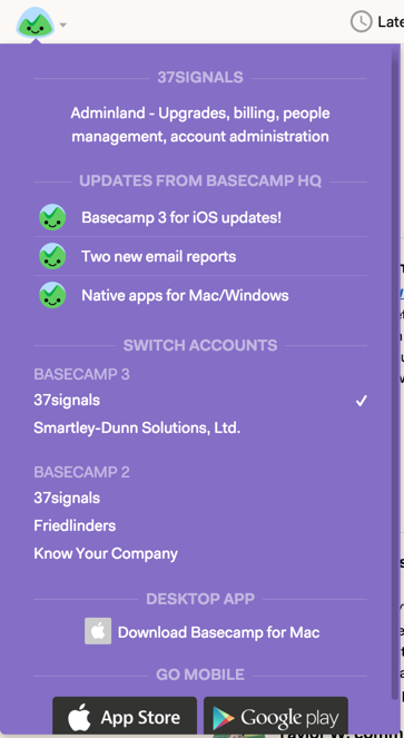
8. “Junk drawer” menus
Just like the name suggests, “junk drawer” menus are menus where a lot of unrelated options are thrown in, never to be spoken of again. It`s the place where you put everything that has nowhere else to go.
While “junk drawer” menus may seem like a convenient way to include numerous functionalities, they create more UX issues than they fix - especially for complex applications with a lot of options. Because they are poorly organized and group unconnected elements, this type of menus are hard to navigate. With an excessive number of options hidden within a “junk drawer” menu, users may struggle to discover and explore all available features, thus missing out on valuable tools and content.
[Source: medium.com/@jasonfried]
9. Lack of contextual help
Contextual help is a great way to provide guidance and assistance to users in the context of their current task or interaction, hence the name. Let`s say you are filling out a form. Contextual help can provide feedback regarding the type of content you need to fill in.
Tooltips, inline suggestions or contextual overlays are as valuable or even more so than an exhaustive knowledge base. Why? Because they provide information exactly at the moment the user needs it, contextual help is more likely to be remembered and acted upon.
10. Not giving users a sense of progress
Remember the part about “system status visibility” and always letting the users know what`s going on? Progress indicators are another example of this. If users are completing a walkthrough, let the user know how many steps they have left. If the user has to download or install something as part of their onboarding experience, let them know how much longer it will take.
The lack of progress indicators not only makes the system nontransparent, it can also make users lose motivation. When users have a clear sense of how far they have come and how much is left to accomplish, it provides a sense of achievement and encourages them to complete the task or reach their goal.
Worried about making costly, but easy to avoid mistakes in your own software product? We`re offering a free UI/UX expert assessment, no strings attached. You book a free consultation call and we evaluate your application against core UI/UX best practices. You then get an overall usability score for your product and actionable improvement recommendations for 3-4 complex screens (screens packing a lot of functionality).
Contact us to book a free UI/UX assessment or click on the banner to read more.


