April 30th, 2026, posted in for_founders
by Adelina
This article is part of the Original Design & Functionality series of our UFOs UI/UX Framework. The framework is a tool we created based on our 10+ years of experience in building complex software and thousands of hours of design meetings and feedback. Developers, designers and entrepreneurs can use this framework to gain a better grasp of the UI/UX process and build awesome apps as a result. To learn more about the UFOs UI/UX Framework and each framework component, please go here.
This article is part of the “O” from UFOs, the framework component that talks about what makes a design stand out, whether it's the small touches or highly customized features.
Ever wondered what makes app designs on Dribble, Behance or UpLabs look so polished? For one, they don't have to account for handling real data. The kind which uses tables grouped on multiple levels, charts with hundreds of data points or countless filtering options. Real life is messy.
That's not to say data-heavy apps can't look just as good. They just require a bit more strategic thinking and some solid design patterns to prevent your app from turning into a UI Frankenstein. So, before adding in another multi-level dropdown menu or forcing a thousand-row table inside a modal, check out some of our tips & tricks for handling data-intensive UI.
Since most of the heavy work is done through tables and charts, that's what we`ll be focusing on in this article. At the end you'll also find a useful Figma plug-in for populating your designs with real data.
Taking the grind out of data grids. UI for data-heavy tables
Multi-level grouping
Grouping data is really useful when you have a huge amount of entries and you want a neat and tidy way to visualize your tables. This also allows you to perform actions on one or more groups of items and to quickly see sum totals or other aggregated values. You can group items based on one or more criteria.
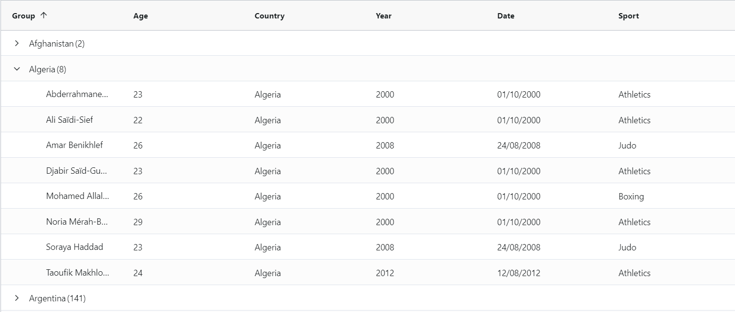
Data table grouped by one criteria (Country)
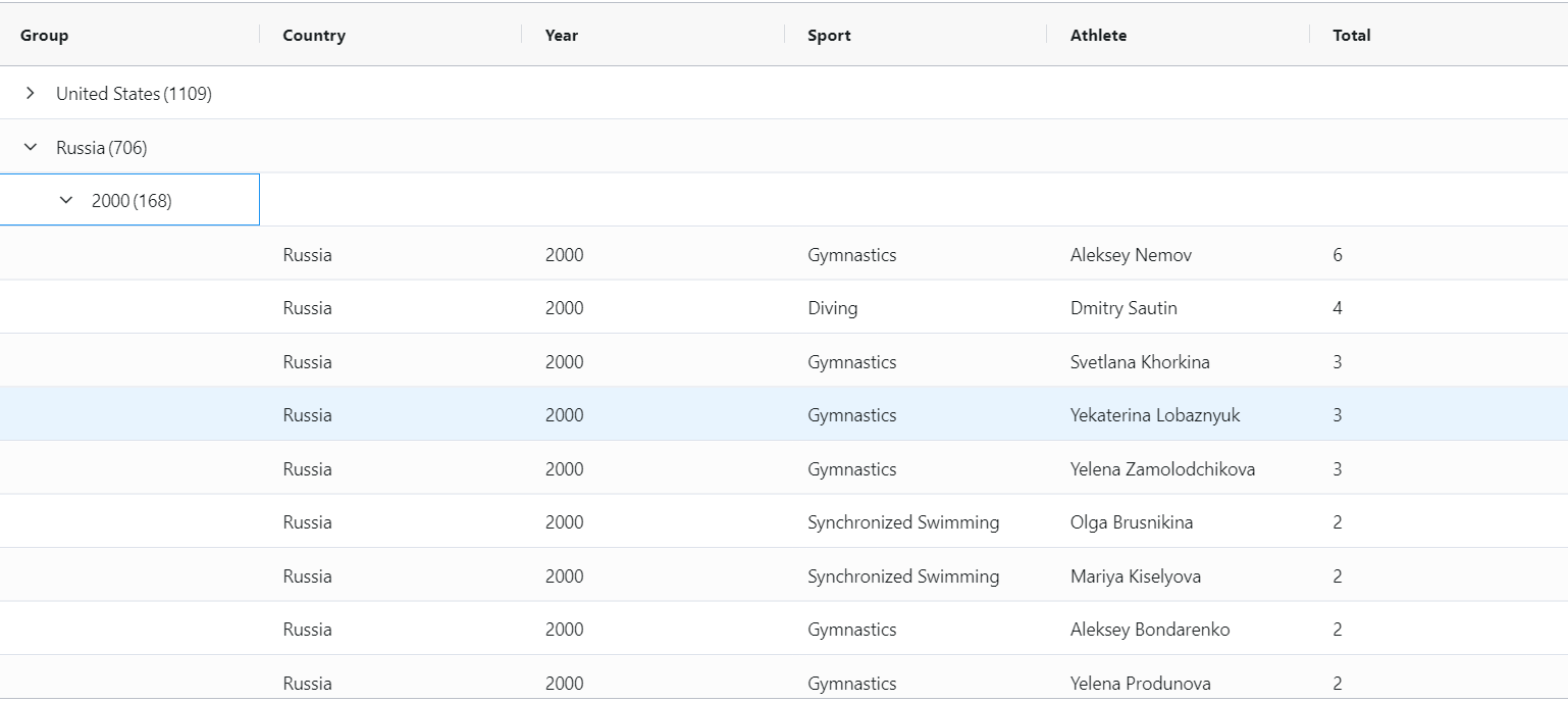
Data table grouped by two criteria (Country and Year)
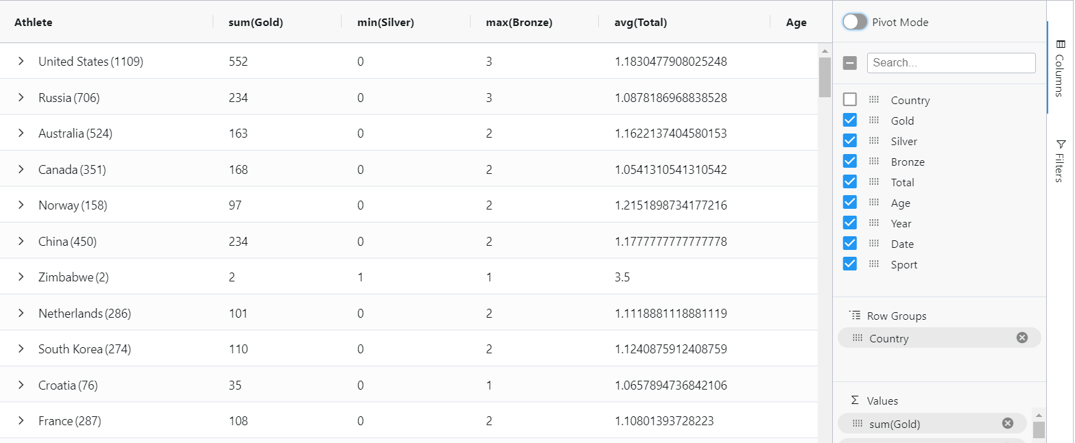 Grouping with aggregated values
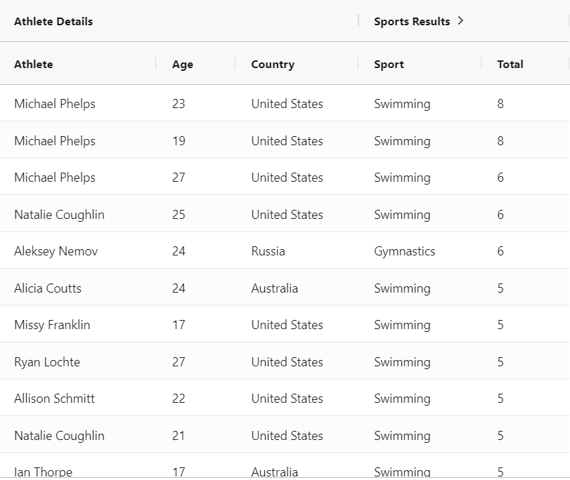
Grouped header
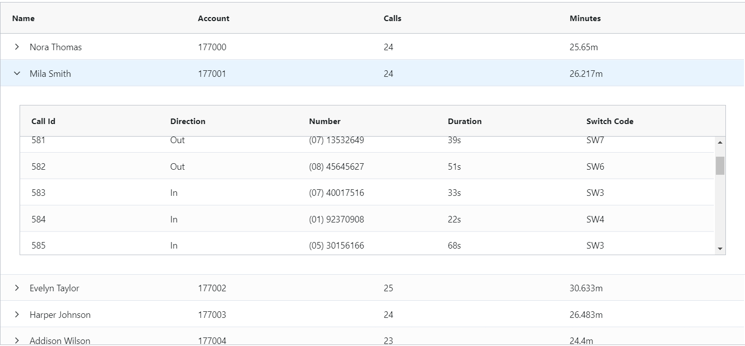
Expandable rows
Sometimes you might want to add more details to the table entries without burdening the user visually. A great way to hide additional information, while keeping it easily accessible, is to use expandable rows. The data stored in the expanded slot can take various forms: lists, timelines, stats and additional descriptions. Some data grid solutions even allow tables with all the features and filtering options a table can have. It's like having a table within a table. Think of all the amount of information you can store and view for just one entry.
Customizable columns
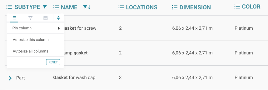
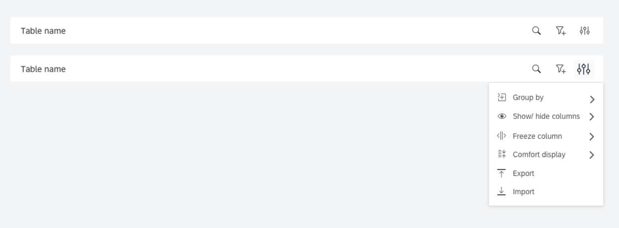
A good table design should allow users to customize how they view data as much as possible. Especially when there's a lot of it. Some of the most useful features include:
- Hiding low priority columns
- Freezing in place important columns to maintain context when scrolling
- Sorting columns in ascending or descending order (Tip: displaying sort icons on all the columns all the time can clutter the design. A simple solution is to show the sort icons only on hover or when they are active.
- Auto Resizing columns to display information
Depending on the use case, you can do this either at column level or you can include a menu in the table header allowing users, for example, to show or hide columns, freeze columns etc.
 Source: https://uxdesign.cc/data-table-for-enterprise-ux-cb48fb9fdf1e
In-line editing
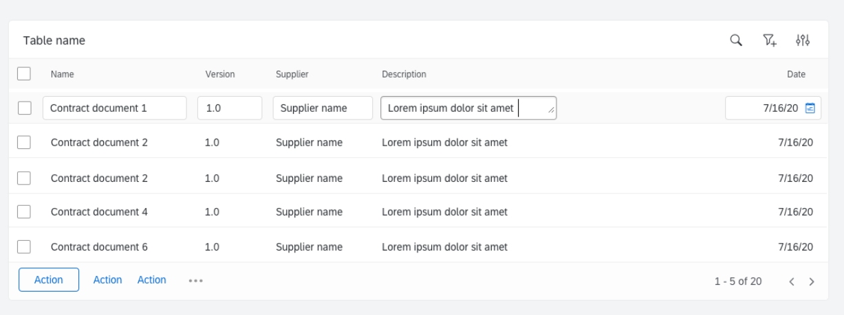
For data which is edited often, you might consider making the whole table editable like an Excel spreadsheet, as opposed to editing the entry in a dedicated page or modal. This allows users to update entries a lot faster without loading a separate page.
In some cases, you might want to bulk edit entries, for example rename a batch of items. An easy way is to select the entries through multiple select (either check boxes or drag & drop) and have a modal show up displaying the Name field in editable form.
 Source: https://uxdesign.cc/data-table-for-enterprise-ux-cb48fb9fdf1e
Advanced filtering
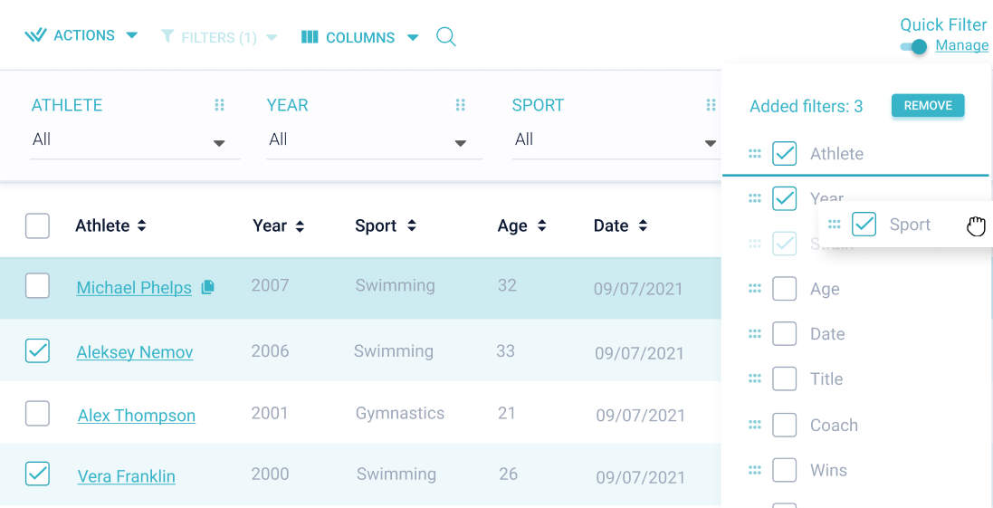
Advanced filtering is the bread and butter of data-heavy tables. Actually, it's one of the main reasons tables are still one of the most popular ways to display data. Advanced filtering allows a drill down into the data and reduces the noise.
You can prioritize filters based on how frequently they are used and leave the rest under a filter menu. What's more, you can allow users to customize what filters they want to keep on the data table.
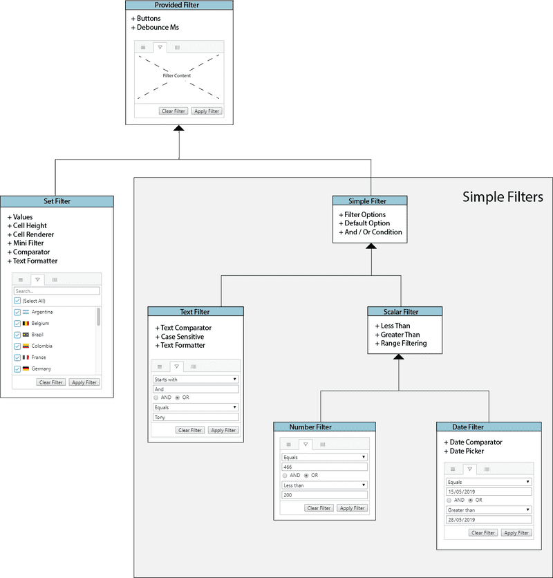
Using operators is another way to allow users to filter high volume data efficiently. Some of the most common operators include:
- And /or condition
- Less than
- Greater than
- Starts with
- Equals
Source: https://www.ag-grid.com/javascript-grid/filter-provided/
Making big data easy on the eye. UI for data-heavy charts
Choose the right chart type for the job
The type of visualization you choose heavily depends on the data you need to represent. No matter how good a chart looks, if it's not fit for the job it will only obscure the data instead of making it easy to read. When dealing with large volumes of data, the biggest danger is choosing a chart type unfit for handling the required amount of information.
For example, a pie chart is best used with a maximum of 6 categories. Anything more than that and the slices simply become too thin to read properly. Furthermore, if the values are very similar, you will be unable to order slices based on size and the pie chart loses its purpose. A better way to show data in this case would probably be bar charts.
A good question to ask yourself when choosing the chart type is “What relationship does the chart need to represent?”. This can vary between:
- Comparison/ differences over time: bar charts, line charts, area chart
- Relationship between variables: scatter plot, bubble chart
- Distribution of values: box plot, histogram
- Composition of an entity: pie chart, stacked bar charts
Don't rely exclusively on tooltips
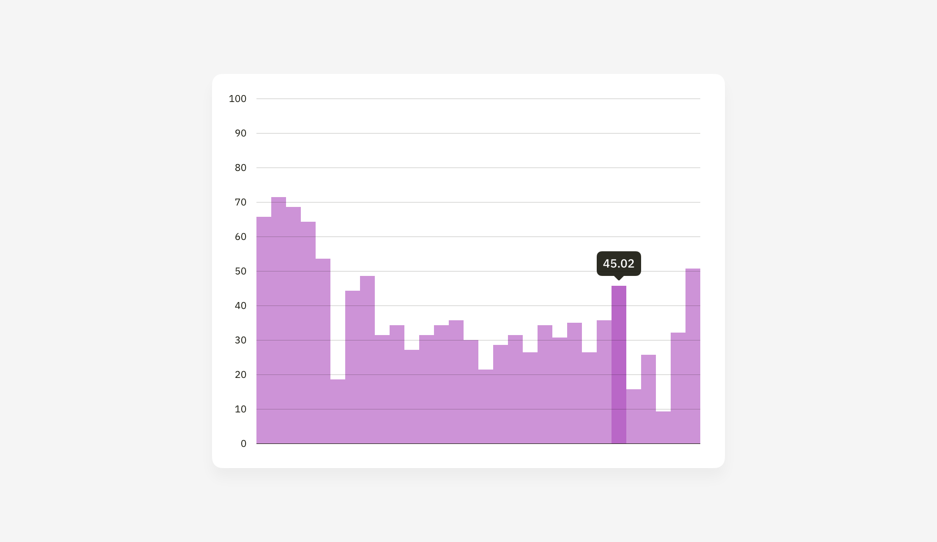
Tooltips are a great way to offer, well...tips to users. In the case of charts, they can be used to show numbers and figures when hovering over data points. However, if the data is continuous and there are many data points, hovering to see numbers can get confusing pretty fast. And it doesn't allow any real data analysis or comparison.
In this case, using bar charts is better than “snakes” (although snakes give the visual illusion of continuity). Vertical bar charts are easier to read when you have a lot of data points and you can complement tooltips with a numbered grid. Column charts are the most straightforward way to compare different values or show differences over time.
Source: https://medium.muz.li/dataviz-sins-976f3a08948c
In some cases, you might even consider displaying numbers without tooltips at all.
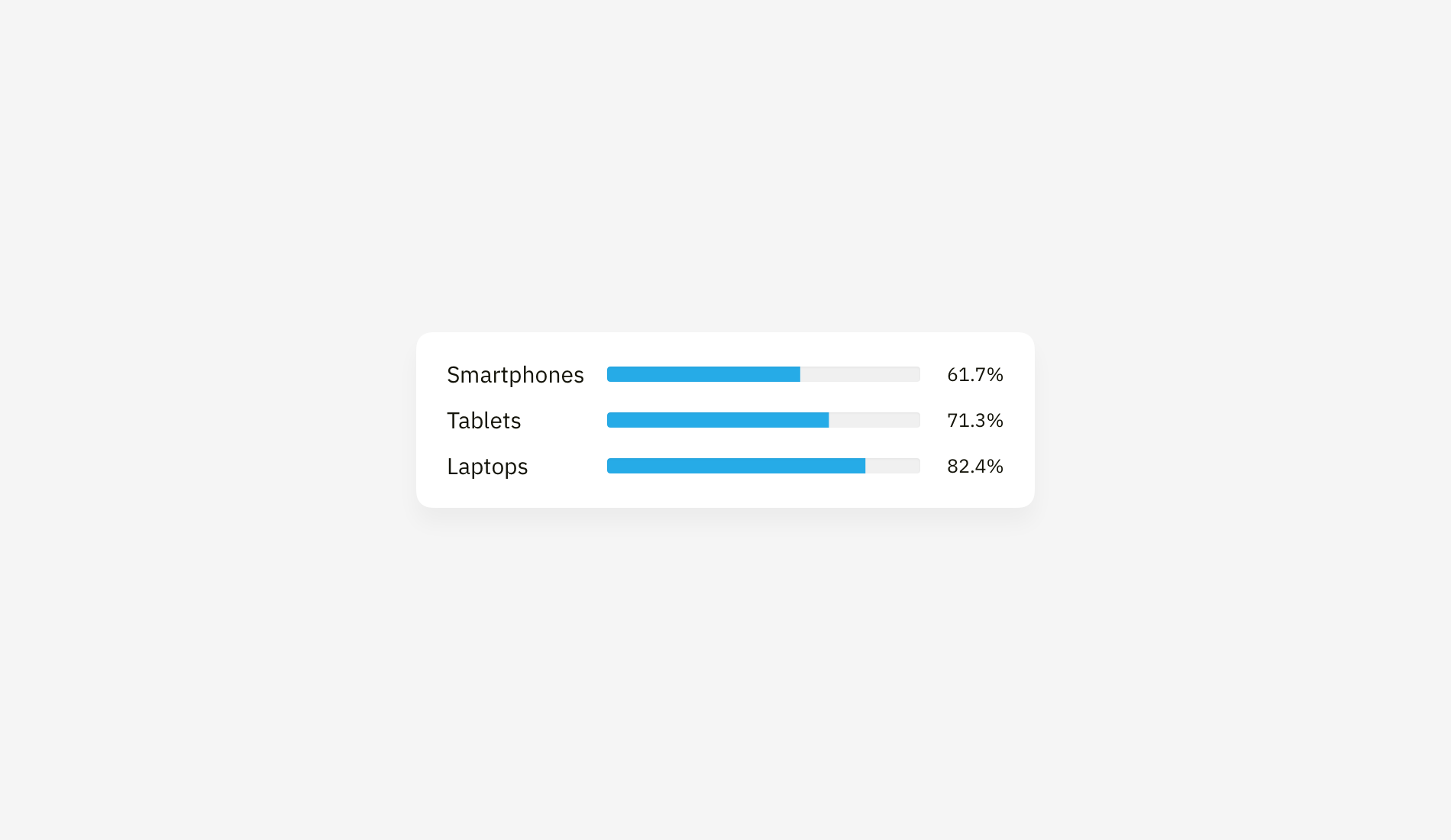 Source: https://medium.muz.li/dataviz-sins-976f3a08948c
Make data easy to compare at a glance
For pie charts this would mean ordering slices according to their size for easier comparison. Additionally, you can use a treemap, where rectangles of various sizes represent the percentage. The bigger the surface, the bigger the percentage. Although people are usually better at comparing lengths, areas are also a good way to compare data at a glance if you want to spice up your design with something more than bar charts.
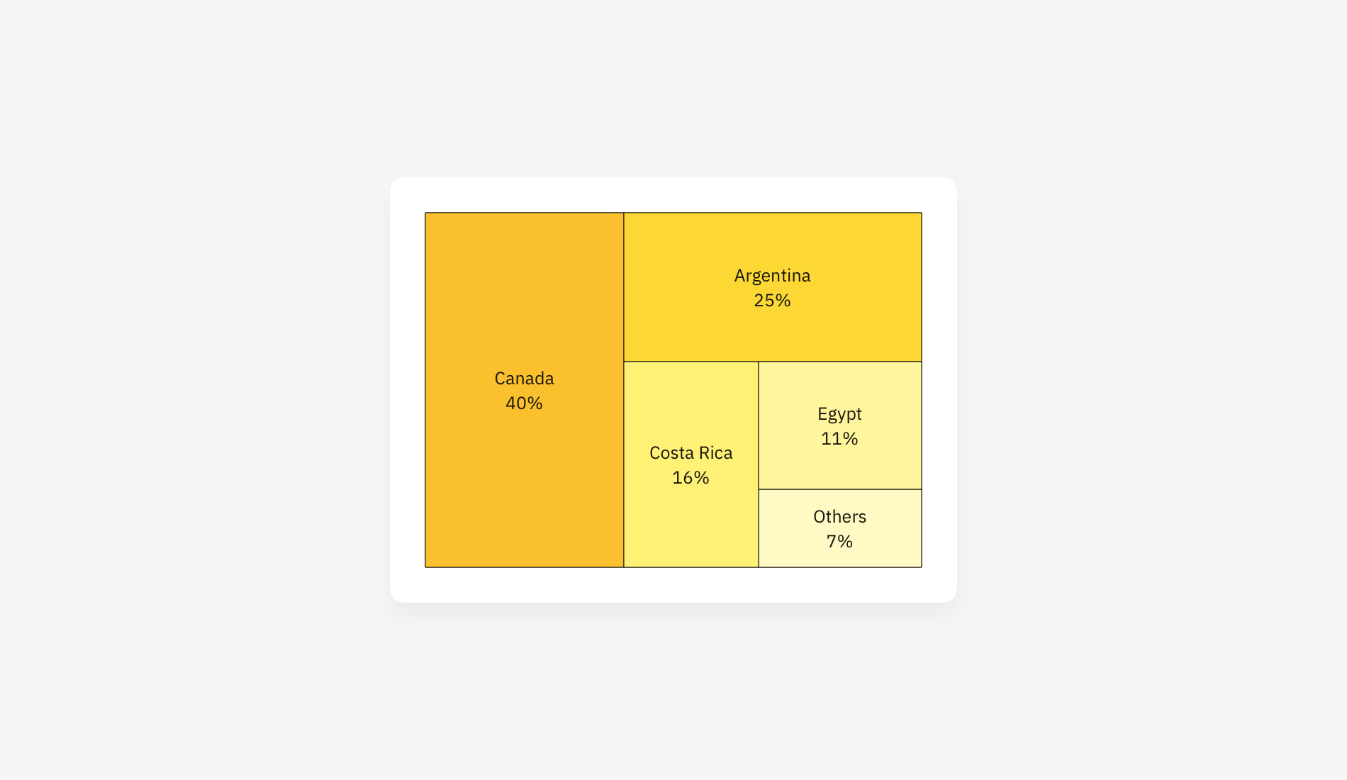 Source: https://medium.muz.li/dataviz-sins-976f3a08948c
Use color to support, not distract
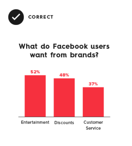
Data-heavy dashboards are already at risk of feeling cluttered. In addition to removing anything that doesn`t support the data (extra text, unnecessary illustrations, drop shadows) you might also consider using color to aid visualization and not distract the user. Some tips & tricks include:
- Using the same color to represent the same type of data.
- Using contrasting colors to represent variations in data
- Making sure there is enough contrast between colors
- Using color associations to signal statuses: green for go, red for alert etc.
- Selecting colors appropriately. Some colors stand out more than others and they might give unwanted weight to the data
Source:https://www.columnfivemedia.com/25-tips-to-upgrade-your-data-visualization-design/
If you really want to stress test your design you can use a Figma plug-in called Google Sheets Sync. This allows you to see how your design handles high volume data, as close as possible to the real thing. You can create Google sheets with dummy data and then load it with the help of the plugin to populate your tables.
At UPDIVISION, we specialize in designing and building complex apps. If you would like a hand with your project, contact us and let's see what we can do together.


