April 22nd, 2026, posted in learning
by Adelina
This article is part of the Understanding series of our UFOs UI/UX Framework. The framework is a tool we created based on our 10+ years of experience in building complex software and thousands of hours of design meetings and feedback. Developers, designers and entrepreneurs can use this framework to gain a better grasp of the UI/UX process and build awesome apps as a result. To learn more about the UOFs UI/UX Framework and each framework component, please go here.
This article is part of the “U” from UFOs, the framework component that strives to give you better tools to understand the business needs of your clients in order to build better apps.
Imagine hiring someone to retile your roof. When they arrive, they ask for a picture of how you would like the roof to look. At no point during the conversation, do they ask why you want to retile your roof. What previous problems you faced with it, maybe due to the climate or poor choice of materials. At no point do they discuss the pros and cons of various tiling materials, what would be the best fit for the job and why. Would you hire them?
It's funny how something considered unacceptable for a licensed tile installer is very much still the norm in UI/UX design. For a very long time, UI/UX designers have been seen (and sometimes acted) as doers, not product owners. A person who blindly executes designs based on client specifications. No questions asked. Or rather, only one question asked: “HOW should this look/work?”
What you`re actually telling the client when you ask “How” instead of “Why”
Asking “How” rarely enables brainstorming. When you ask “How” all you`re getting is the client`s already established opinions regarding how the app should look and work. You might think you are doing the client a favour by giving them exactly what they want. But what you are in fact doing is robbing them of the opportunity to build a better app. Even worse, you`re involuntarily telling the client that:
- You lack the expertise to have an opinion - wanting to be told how to do things hints at a lack of expertise. No one expects a UI/UX designer to be familiar with all industries, especially if you`re working on a niche market - let's say an AI recognition search engine for mechanical parts. But you can draw on your experience in other industries to come up with viable ideas, while you gradually learn this new industry. Design patterns are meant to be translatable and some of the best ideas might occur cross-industry.
- Your only role is to create pretty things - focusing too much on “how” often results in concentrating too much on how things look. This gives out the wrong impression that UI/UX design is just a matter of making things look pretty. When in fact, how things look is a direct consequence of how they are used. This holds true even for redesign projects, where UI touch-ups should be part of a broader effort to improve existing user flows.
- You don't really care if the app is going to be successful or not - if you don't mind forcing a thousand-row table inside a modal because that's HOW the specs say it should be done, you might be doing something wrong. And it might signal a lack of genuine interest in the app you`re designing. Clients shouldn't like you because you never contradict them. They should like you because you always come up with the best UI/UX solutions. Even when that goes against what they were envisioning.
Why asking “Why” is the key to building better apps
At the end of the day, asking “How” doesn`t do anyone any favours. As a client, you might miss some game-changing opportunities for your app and, as a UI/UX designer, you won`t really get the chance to grow. However, if you start consistently asking “Why”, you might notice some interesting things begin to happen:
- You`ll understand the industry a lot faster - no app is an island. Apps exist within an ecosystem of people, businesses and other apps. When you ask why something happens, or is needed or looks a certain way, you are forced to find answers. This might mean looking at competitors, asking end users, interviewing product owners or reading white papers. Whatever it is, searching for the answer automatically makes you more familiar with that industry.
- You`ll come up with ideas you`ve never thought of before - understanding why users need a certain feature, for example, or what's it used for in their daily workflow, will give you a lot more room for brainstorming. Asking “How” narrows everything down to one way of doing things. But, once you know WHY, you can come up with a lot more ways of accomplishing the same task. Some of them might even be unexpected.
- You`ll get a boost in product owner mentality - what happens when you ask “how” enough times and no one has any answers left? That's why product owner mentality is such an important component of a UI/UX designer`s mental framework. It allows designers to pick up from where the actual product owner left off. And to get involved in building the app at a level beyond that of moving UI components around. You cannot get involved until you start asking WHY. Ideally more than once.
But how do you ask why? Introducing root cause analysis & the 5 whys method
The basic premise of the 5 whys method is that by repeatedly asking “Why” (five times is a good rule of thumb) you can determine the root cause of almost any issue. The 5 whys work great in software development in general and UI/UX design in particular because:
- It`s iterative, each answer forms the basis of the next question. This works great for sprints and in Agile environments. At the end of every sprint you can put forward a problem, ask why it happened and dwell deeper into its causes with each sprint, if needed. You can also assign responsibilities for solutions.
- It allows teams to determine the relationship between different root causes of a problem. Is poor UI/UX design a matter of inaccurate requirements, poor communication, the lack of an established process or simply not enough user interviews? If it's all of these, how do they relate to one another? Sometimes, what appears to be a technical problem, might be in fact a human or a process issue.
- Unlike repeatedly asking “how”, which may eventually lead to a dead end, asking “why” multiple times promotes brainstorming. It also helps find countermeasures by putting things into context.
- Is straightforward enough to be easily integrated into a software development team`s daily workflow, regardless of its size.
Below is a 5 whys example applied in a UI/UX design scenario:
Q1: Why did the client say the sign-up flow is broken?
A1: Because they managed to sign up a second time with the same email address.
Q2: Why did they manage to sign up a second time with the same email address?
A2: Because there was no warning message.
Q3: Why isn't there any warning message when you want to sign up for a second time with the same email address?
A3: Because we just didn't think of it.
Q4: Why didn't we think of it?
A4: Because we didn't include it in the specifications.
Q5: Why didn`t we include it in the specifications?
A5: Because we were in a hurry.
Based on the 5 whys analysis, you can then create and assign tasks to the appropriate members of the team.
UI/UX Designer > Design warning UI component and rethink flow.
Project Manager > Improve the process of documenting specifications.
Team Lead > Assign tasks in a timely manner and get a firmer grasp of time management within the team.
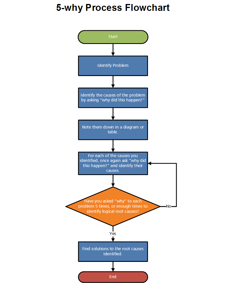
The 5 whys method can also be represented visually as a flowchart.

Source: https://buffer.com/resources/5-whys-process/
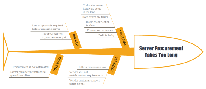
What's more, you can also use the method itself to create diagrams for each root cause. Cause-and-effect diagrams usually associated with the 5 whys method are called “Ishikawa diagrams” or “fishbone diagrams”. They show the potential causes of a specific event and allow you to group causes into categories in order to identify and classify variations.
Below is an example of how to integrate the 5 whys method into the process of creating Ishikawa diagrams:
Step 1. Start with a problem statement. Sometimes it might be helpful to write it down exactly as it was phrased by the stakeholder.
Step 2. Create an Ishikawa diagram. This acts as a visual representation of the hypothesis that could explain the problem statement.
Step 3. For each diagram branch, create sub-branches i.e. other specific factors which may cause the problem.
Step 4. Identify more levels of causes by using the 5 whys method for each major branch. For example, you might have an issue with a development project taking too long which in turn leads to the problem statement “client is angry”. By using the 5 whys, you can identify if there is an issue with the developers (in which case they might require further training) or if this is a systemic problem - certain important processes have not been put in place.
Step 5. Analyze the Ishikawa diagram and prioritize the best hypothesis.

Source: http://www.nathaliekarasek.com/ishikawa-diagram-software-development/
Apps are tangible things. But they're also the result of how we think about things. And, in most cases, how we think is heavily influenced by the questions we ask. Asking the right questions is an important part of building better apps. And it's also a lifelong practice which starts with a simple question.
If you`re keen on asking “why” together and trying to find the best answers for your app, drop us a line at [email protected].


